Layout & Compositions
To build a high tech brand we need to create en-gaging experiences. Create compositions that are smart, neat and rich.
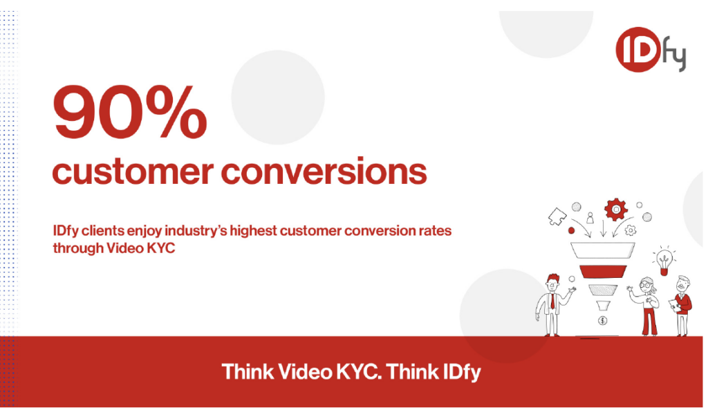
Integrating textures, shapes and colors add more depth to the visuals. Add colors and elements along with photography to bring expressions and life to the creative. The examples illustrate the usage of colors, elements and imagery that needs to be referred in all our communications.
Compositions Guidelines
All creatives should contain our primary colors either in fonts or elements.

- Maximum three colors are used in a creative.
- Blue & Grey are primary colors hence they are more visible.
- Orange is a secondary color, hence used for icons just to add support or enhance.

- Use actual people for testimonials, brochures or collaterals.
- Always use black and white images
- Use light color Elements to enhance the creatives

- The watermark effect should always be on a black and white image.
- Always use our primary color for watermark effect
- For any partnership or testimonial creative the partner logo has to be next to our logo. Either on top left or top right.


- For illustrations use our primary colors.
- Additional elements to be in our secondary colors. Make sure we do not use more than one secondary color in the overall creative

- Our logo has to be on top left or top right corner.
- Use variant logo on dark background.
- Use watermark on black and white images only.