Our Logo
Our logo consists of bold red circle that signifies alert and attention.
The name defines identify with the focuse on ID
The red in the logo is a warning ‘Stop’ sign to fraudsters.

Logo Placement
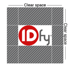
Protect the logo by keeping clear breathing space from all sides.
Make sure that there is no overlapping on the logo anywhere close to the clear space.

Logo Variations

The Original
Red circle with white ID & fy in grey

The Variant
White circle with red ID & fy in white
Logo Usage




Color is a delightful way to express who you are as a brand.
Wherever the logo is being used its an opportunity to show who we are.
IDfy brand logo should be clearly displayed when in use and should be visible to the viewers.
- On White Background use the Original logo
- On darker backgrounds use the Variant logo.

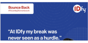

- For creatives or collateral where there is a white background use The Orignal logo
- While using colored backgrounds useThe Variant logo.
- Making testimonials, decks and creatives our logo has to be on top left or top right corner.
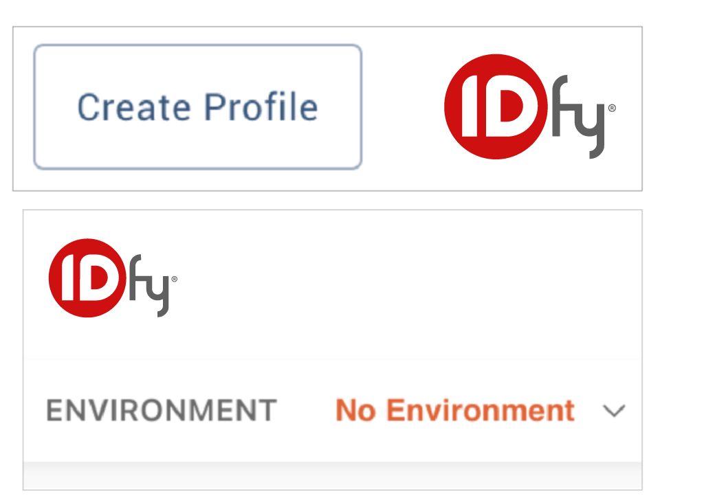
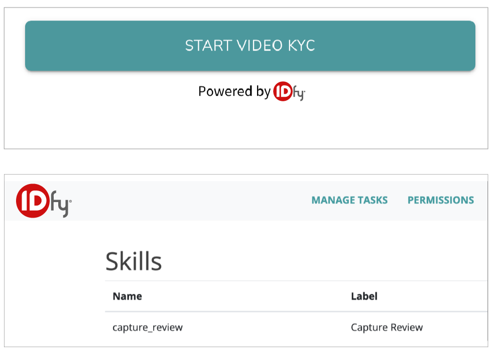
- If the background is white on a product page, portal or backend then use the original logo.
- If the dashboard, backend or website has a colored background then use the variant logo.
Avoid doing this to the logo
Don’t
use the logo with a border
use the logo with a border
Don’t
used blur / pixelated logo.
used blur / pixelated logo.

Don’t
use the logo over a chaotic background.
use the logo over a chaotic background.

Don’t
use the logo where it blends with the background color.
use the logo where it blends with the background color.
Don’t
cut the logo.
cut the logo.
Don’t
stretch the logo.
stretch the logo.
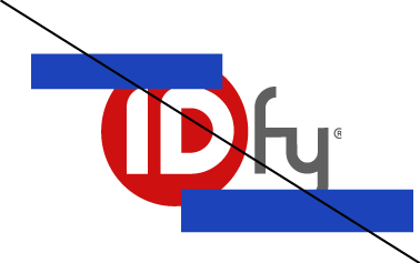
Don’t
overlap the logo.
overlap the logo.
Tagline


- On a white background use the colored version of the tagline
- On colored background use the white version of the tagline